More and more portfolio sites have been morphing into blog/portfolio sites, or blortfolios as I call them (I wonder if this word will catch on ?). During the process of designing this site, I compiled a list of my favorites blog/portfolio sites to inspire me. Here are some of them, along with a few observations.
The first impression counts most
Some designers choose to welcome you with a distinctive graphic which sets the tone for the whole site, and beautifully showcases their skills.
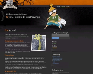
1. SR28
SR28 features two distinctive cartoonish illusrations, and great typography. This is a site that makes an immediate impression on the reader.
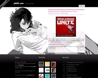
2. Jek2k
Once again, a gorgeous illustration takes up a sizeable part of screen real estate.
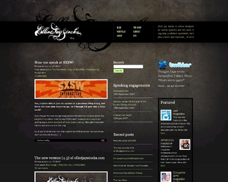
3. Elliot Jay Stocks
http://www.elliotjaystocks.com/blog
A more subdued style. But the calligraphy here is just as distinctive as a more traditional illustration.
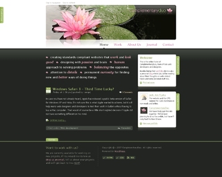
4. Complimentary Duo
http://www.complementaryduo.com/
Here, the main element is a photo of a lotus flower. It gives the whole site a soft and relaxed feel, and the organic associations that come with nature make the whole thing warmer and friendlier.
The traditional approach
More professional looking sites usually decide to let the portfolio come first, and the blog is usually tucked away in a corner, waiting to be discovered. Those sites generally belong to the designers that are already established, and don’t need to prominently feature “Top 10 WordPress plug-ins” type articles hoping to earn money from Google Ads. Design teams also tend to prefer this style, and it usually goes well with a minimalist approach.
5. 31three
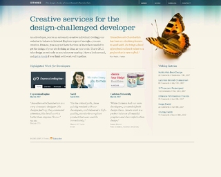
This is probably one of the most famous portfolio sites, as it has been featured in lots of galleries, and Jesse Bennett-Chamberlain is reponsible for the Expression Engine site redesign, documented in this Digital Web article. It featured everything a portfolio site should have: a big tagline, a strong visual element (the butterfly), a quote from a client, project thumbnails above the fold, and weblog entries in a sidebar.
6. Pixel Implosion
A very small site that gets the job done, with nice 3D effects.
7. Wake Interactive
http://www.wakeinteractive.com/
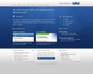
The classic webdesign agency look, but very well done.
8. Badboy
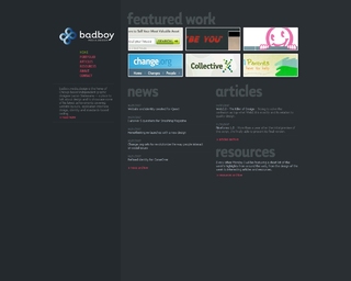
A very simple minimalist style, with trendy colors (pink & grey) and a big “featured work” block.
The blog comes first
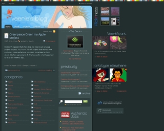
One the other hand, some designers choose to give priority to the blog. Sometimes the blog itself can be the only proof you need of a designer’s skill, as with Veerle’s blog (which is so beautiful it doesn’t even need to include a portfolio!). The strategy here is to write captivating articles to gain recognition among the design community, and bait potential clients into viewing your portfolio.
Or maybe you’re just so well-known that people are going to see your portfolio even if they have to click 13 times to get to the page.
9. Bartelme
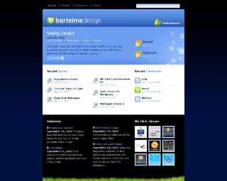
Wolfgang Bartelme is an icon designe, and it shows through the attention to details on this site. I especially like how one article is featured and the others are just linked to, which keeps the page nice and compact.
10. Veerle
Most people know this site through its tutorials. Once again only one article is featured on the homepage, which leaves lots of space for other things like a flickr widget and lots of ways to easily navigate through the archives.
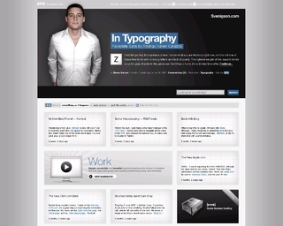
11. Svenigson
This site displays blog posts in a grid, and the portfolio link takes up two squares to make it more visible. A break from the traditional blog layout, very clean and very well tought out. Another good idea is the use of a flickr slideshow to display the portfolio.
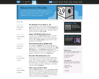
12. Rikcat
Although Rik Catlow also has a portfolio site for his webdesign business, I chose to feature the one for his illustrations, simply because I like it better. This site has a distinctive color scheme, and makes good use of repeat patterns (like the rounded corners or the stripe patterns).
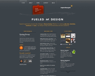
13. Supercharged
Very nice use of the classic dark grey/orange color combination. Almost minnimalist, but the very detailed leather tag keeps things from getting too serious though.
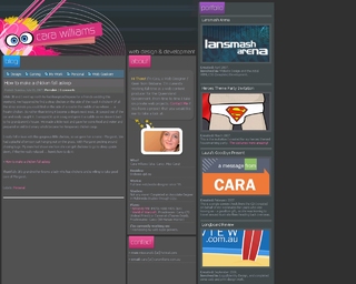
14. Cara Williams
One of my favorite sites in this list, because it manages to do everything: have a distinctive illustration on the frontpage, show the blog, the portfolio, and on top of that add an “about” section. And it’s also filled with cool ideas. Scroll down all the way to the bottom to see the RSS button.
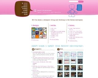
15. Jaredigital
This is another site that you won’t forget once you’ve seen it. A good use of the popular pink/baby blue color combo, with a cute robot for bonus points.
16. Six Shooter Media
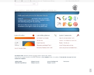
http://www.sixshootermedia.com/
This site is a little busy but keeps things organised with a lot of whitespace. Also makes great use of icons.

